Nishat's Cake
& Bakery
Handcrafted Cakes for Every Occasion
A beautifully crafted website for an artisanal Bologna-based bakery. Custom cakes, cupcakes, cookies, and premium chocolates, all designed to be ordered with ease and presented with the elegance the brand deserves.
Website Preview
01
02
03
Key Features
01
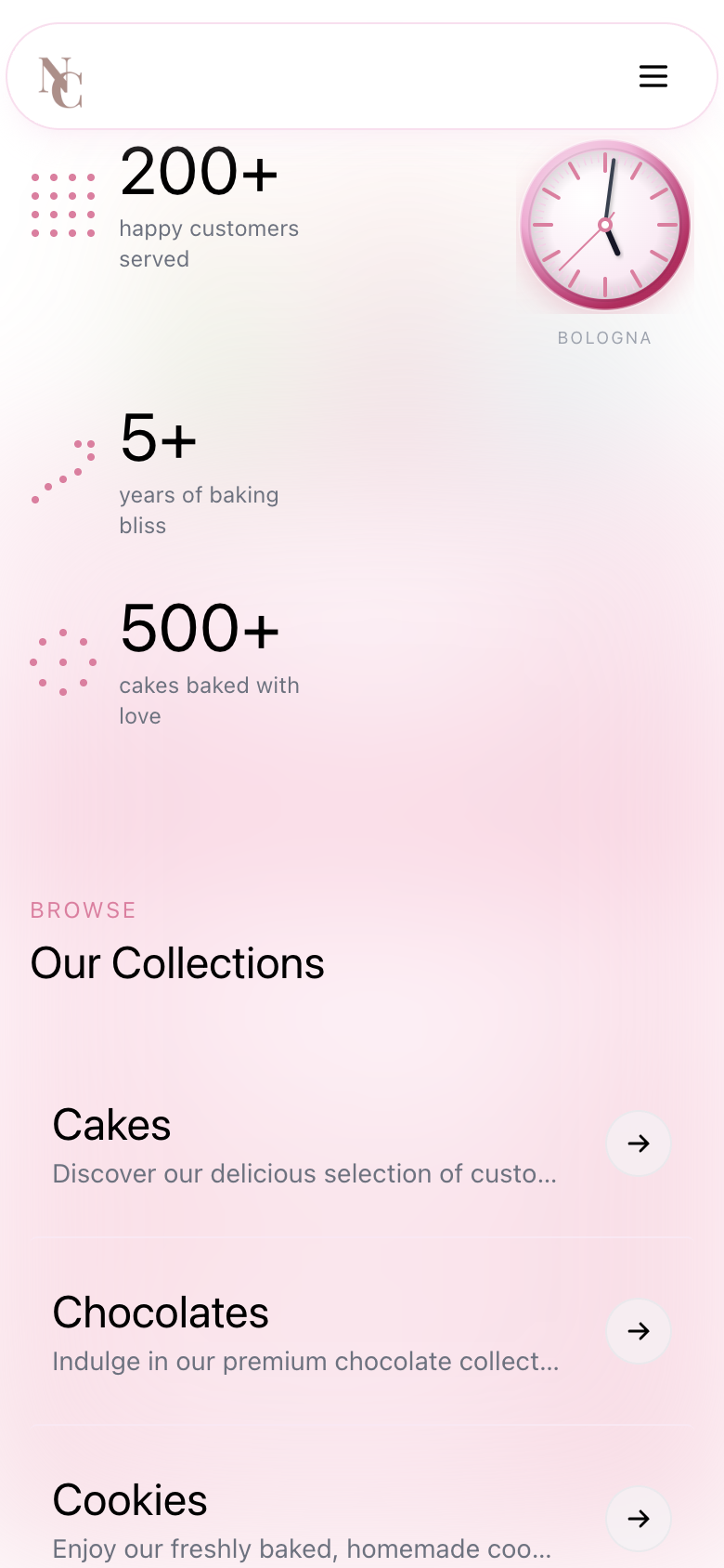
Bologna Clock
Dynamic IslandAt the heart of the app sits a unified Bologna clock set to Italy's timezone and themed in the brand's signature baby pink palette. But what makes it stand out is the Apple-inspired Dynamic Island pill at the top of the screen. It dynamically expands and contracts in real time, surfacing relevant context without ever leaving the view. Delicate, purposeful, and unmistakably modern.
01
Bologna Clock
Dynamic IslandAt the heart of the app sits a unified Bologna clock set to Italy's timezone and themed in the brand's signature baby pink palette. But what makes it stand out is the Apple-inspired Dynamic Island pill at the top of the screen. It dynamically expands and contracts in real time, surfacing relevant context without ever leaving the view. Delicate, purposeful, and unmistakably modern.
02
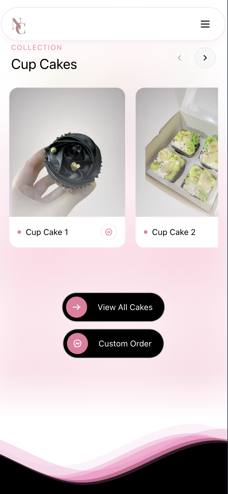
Buttons
Interaction DesignEvery button across the app uses a continuous corner radius, the same smooth squircle geometry found in Apple's own design language. Nothing feels harsh or mismatched. Pair that with responsive touch feedback and every interaction feels tactile and intentional. Small details that add up to a premium, cohesive experience.
02
Buttons
Interaction DesignEvery button across the app uses a continuous corner radius, the same smooth squircle geometry found in Apple's own design language. Nothing feels harsh or mismatched. Pair that with responsive touch feedback and every interaction feels tactile and intentional. Small details that add up to a premium, cohesive experience.
03
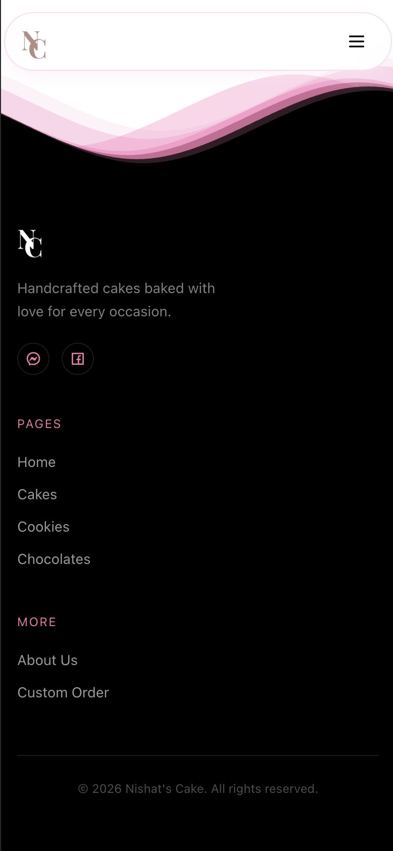
Footer Wave
Motion DesignAbove the footer, a fluid wave animation flows continuously in the brand's baby pink tone. Smooth, looping, never distracting. It adds life to the bottom of every screen and ties the visual language together. A finishing touch that turns a static page into something that feels alive.
03
Footer Wave
Motion DesignAbove the footer, a fluid wave animation flows continuously in the brand's baby pink tone. Smooth, looping, never distracting. It adds life to the bottom of every screen and ties the visual language together. A finishing touch that turns a static page into something that feels alive.
Ready to get started?
Have questions about your next project? Want to discuss how we can help bring your ideas to life? Let's start a conversation.